[Discussion] New user UX #18
Labels
No labels
bug
discussion
duplicate
enhancement
help wanted
invalid
question
suggestion
tracker
ui/ux
wontfix
No milestone
No project
No assignees
5 participants
Notifications
Due date
No due date set.
Dependencies
No dependencies set.
Reference
cadence/Carbon#18
Loading…
Add table
Add a link
Reference in a new issue
No description provided.
Delete branch "%!s()"
Deleting a branch is permanent. Although the deleted branch may continue to exist for a short time before it actually gets removed, it CANNOT be undone in most cases. Continue?
Continuing the discussion on the matrix channel we need to consider how carbon will look for new users who never heard of matrix and have no idea what federation is and how it works and whether we should default to a server or let the user pick one
Key points:
Matrix.org is a huge monolith which is bad for network health
It's also slow which might lead to users making the association that carbon=matrix=matrix.org=slow
We shouldn't overwhelm users with technical details to make sure matrix doesn't look too hard to use
We need to consider the language users will be familiar with. For example discord calls their guilds servers, we should make sure that people don't think mistake matrix servers(homeservers) for groups
We should look into the mastodon ecosytem for inspiration
A lot of things I probably forgot about
Some responses to corresponding points:
1: We need a site that shows a bunch of public matrix instances side-by-side, similar to how https://joinmastodon.org/communities does it.
3: There are 2 big subjects which are required to learn how matrix works, imo:
- Homeservers/Federation
- E2EE (and the user-responsibility (to take care of keys) schenanigans that happen with it)
So teaching these should be the whole load we'd be giving to the users, so maybe there'd be a "Do you come from discord? Read this first, please" when you're on the main website. Or maybe in a fashion that you can scroll down and read these two features. (Headed with "free and open chat protocol" followed by the federation part, followed by the E2EE part)
Maybe a few more readmes for Mattermost, XMPP and WhatsApp/Telegram users.
https://github.com/daydream-mx/keymaker Might be useful later
How would you feel about an explanation of what homeserver means on the home screen?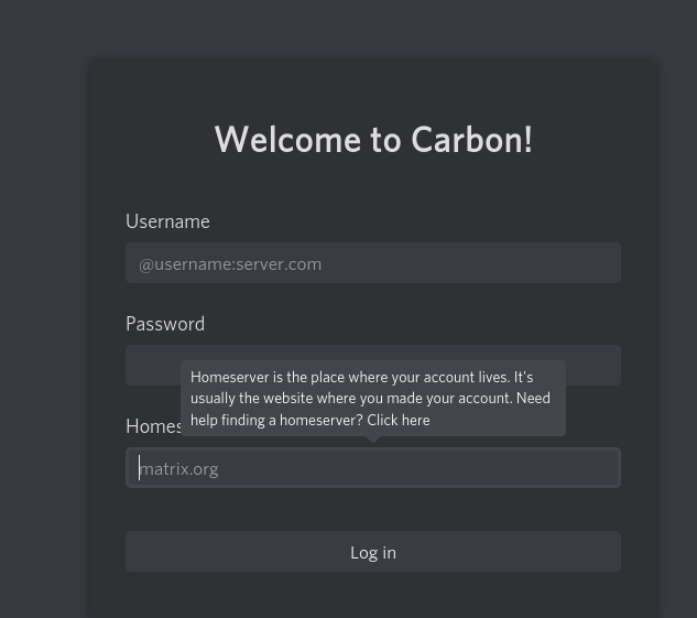
Something like this
The tooltip would only show up when the homesever input was focused and when it was empty
👀
That looks very nice, maybe put the "need help finding a homeserver" line on a newline, and indeed make that link blue, also make the popup last 2 or 3 seconds after someone hovers away from it, so someone has enough time to go to that link.
That's a really good prompt message.
I'd like to use a circled ? icon next to the "homeserver" label that responds to clicking, rather than hovering, or requiring the input box to be empty. Those are too "magic", IMO, and I fear people won't know how to make the prompt appear if they want to see it.
This should probably be made as part of a larger tooltips and modals js file.
Here is what we ended up doing after talking about this on matrix(subject to change)
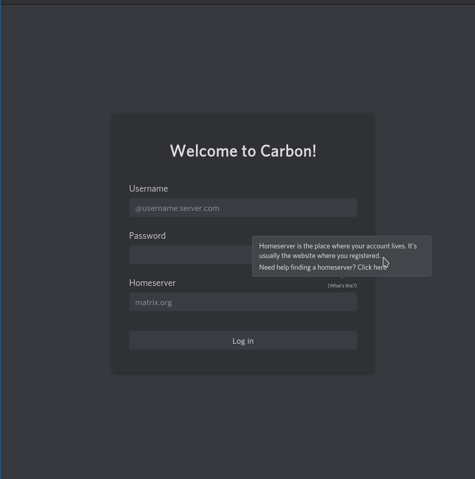
a5309a81b1This is indeed quite like Discord and Guilded logins, but it might be better to ask for the home server first (maybe listing a few popular homeservers such as FENEAS and matrix.org along with "enter another" text box) then proceeding to credentials.
Maybe have that "click here" button go to a page which on it's left side describes what a homeserver is, and on it's right side list some popular servers, the left side should mention that any homeserver can talk to any other.
That popup is quite nice, though I think the grey should be a bit darker.
Element is updating their homeserver selection interface. https://develop.element.io/
We aren't talking about the left sidebar here. Please.
Thanks for the other notes.